It is always interesting to learn that the logos of our beloved companies carry much more than just beauty and conciseness. It turns out that almost every line, its length, thickness, and color play an extremely important role here.
Sprintally has selected 15 logos that will be recognized around the world. They have a meaning that we did not notice before.
1. Adidas
The name of the network of sports stores Adidas was formed on behalf of their creator Adolf Dassler. The logo has changed many times but has always included three stripes. At the moment they are tilted and form a triangle – a mountain. This is a symbolic image of obstacles that all athletes must overcome.
2. Amazon

At first glance, the Amazon logo does not hide anything unusual, but it helps to understand the philosophy of the brand. The yellow arrow resembles a smile: Amazon.com wants customers to be satisfied. The arrow also connects the letters A and Z, hinting that in this store there is absolutely everything – “from A to Z”.
3. Apple
Rob Yanov, a designer who invented the Apple logo: “I bought a whole bag of apples, put them in a bowl and drew them for a week, trying to simplify the details. Biting off the fruit was part of the experiment, and by accident, bytes (bite translates as “bite”) turned out to be a computer term.
4. Beats
The letter B and the red circle of the logo of the American manufacturer of audio Beats are positioned as a person in headphones.
5. Baskin Robbins
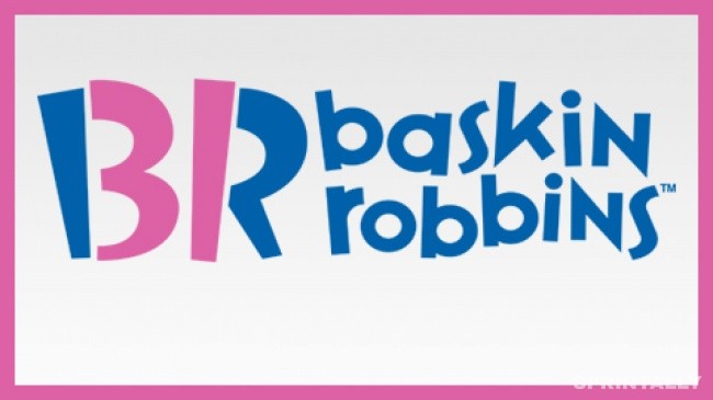
The pink parts of “BR” make up the number 31 – that’s the number of tastes historically had with ice cream Baskin Robbins.
6. B M W
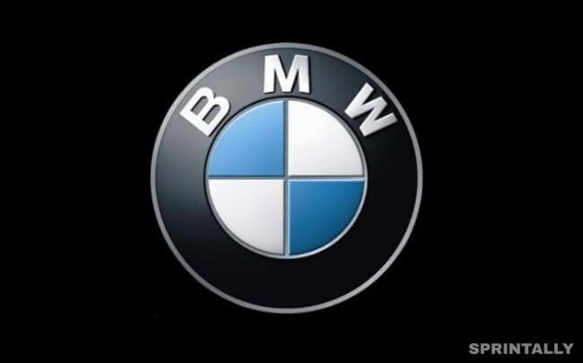
The history of BMW began with aviation, and the company’s logo remains true to its roots. Contrary to the opinion that the center of the BMW logo is the blades of a rotating propeller, this is just a fragment of the flag of Bavaria, it is in their cell.
7. Coca-Cola
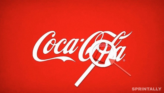
This is a rare phenomenon, but sometimes the hidden meaning can be an accidental coincidence. So, in the Coca-Cola logo in the space between the letters O and L, you can see the Danish flag. The beverage manufacturer used this in his favor during an advertising campaign in Denmark.
8. Continental

Continental is a manufacturer of car tires. One of them can be seen in the first two letters that create the image of the wheel in perspective.
9. Evernote

Elephants are known for exceptional memory. It is proved that these animals can remember faces and events. That’s why the logo of the Evernote notes service features an elephant. And the corner of his ear is bent, as it is customary to bend the corners of the pages. With notes Evernote, you will not forget anything.
10. Formula 1
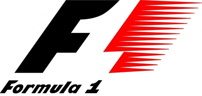
If you look closely at the empty space between the letter F and the red bars, you can see the number 1. The logo conveys a sense of speed.
11. Hyundai

Many are inclined to think that the logo of the Korean conglomerate Hyundai is the first letter of its name, no more. In fact, the letter H symbolizes two people shaking hands (on the one hand – the client, on the other – the representative of the company).
12. LG
The main symbol of the logo of the South Korean electronics manufacturer LG is the stylized face of a smiling person. According to the official description of the brand, this composition indicates the desire of the company to maintain a “human” relationship with all customers.
13. Pinterest
In the logo of the popular Internet service Pinterest, users who can collect favorite images and “pin” them to their online board, a needle is hidden. Look closely at the letter P – it is her sharp “leg” and stylized under the needle.
14. Sony Vaio
The first two letters of the Sony Vaio logo form a wave symbolizing the analog signal, and the last two remind 1 and 0 – the symbols of the digital signal.
15. Toblerone
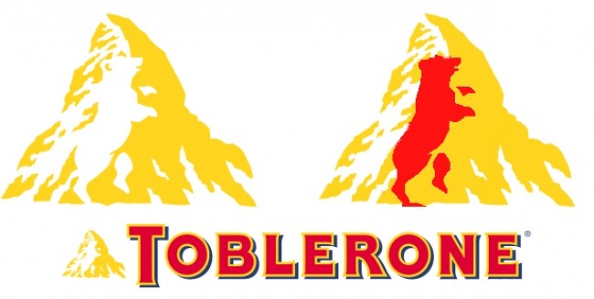
Toblerone is a chocolate company from the Swiss city of Bern. It is also called the city of bears. That’s why Toblerone included the silhouette of this animal in its logo.
16. Toyota
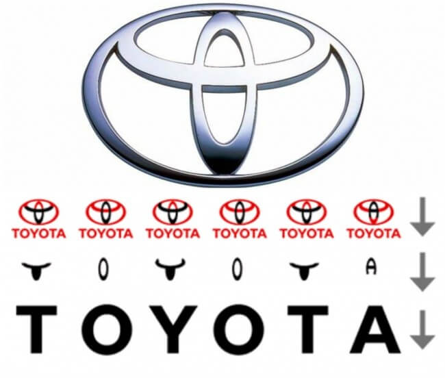
Many compare the logo of the Japanese carmaker Toyota Corporation with the head of a cowboy in a hat. In fact, it is a stylized needle eye with thread threaded into it. This is a kind of hint at the past of the company, engaged in the period of its becoming looms. However, the logo also has one more little secret: its parts are the letters of the word Toyota.
