In this article, you will learn all about Bootstrap, I’ll introduce you to the examples of using Bootstrap and tell you what it is and how to apply it.
What is it – Bootstrap
Bootstrap is a framework, a set of HTML + CSS tools and templates for layout and more efficient and faster creation of sites and web applications more efficiently and quickly.
Bootstrap is a modern assistant, interface developers, designers, and webmasters, available for use under an open license. Note that this framework is very dynamic and regularly updated, so not all of its functions can be correctly supported by old browsers.
Bootstrap is now at the peak of popularity and you can confidently say that it is possible to make any web interface on its basis.
It has the following templates:
- Fonts
- Buttons
- Forms
- Labels
- Navigation
- Grid
- JavaScript Extensions
- Other (I’ll tell you later)
Now the most popular version of the Bootstrap framework is the third one. It was released three years ago. In it, further, development has received adaptability and the principle of mobile-first. The fourth alpha version was released a year ago, this year the version has advanced to the level of “alpha-3”, which means that the developers are already close to completing the work.
Critics of Bootstrap a lot and long talk about the fact that the sites on the bootstrap look the same. Gentlemen, but the services of Google look stylistically the same. And then there are a lot of successful customizations based on Bootstrap, so it’s more like demagogy than the truth.
All the more unnecessary are the words about “identical” sites, when we talk about building interfaces, about prototypes, about administration panels, about small free (!) Services where there is no time to think about design. Or expensive. Do not forget that Bootstrap is a tool not without flaws, but with its advantages.
Advantages of the Bootstrap framework
The modern world is very dynamic and we are constantly confronted with the choice – to make quick prototypes and run them in production, or slowly and for a long time there is something to saw, to alter the layout, to lick everything to the ideal state.
So Bootstrap is about the first. Quickly sketch the layout in HTML, fasten the necessary functionality, ready, go to the startup accelerator!
The main advantages of bootstrap:
- Saving time (and hence money) – you save effort because you use already ready classes and design. Spend the saved energy and money to develop additional functionality and you will only benefit.
- Adaptability (mobile-first), high speed and optimization, interface standardization – dynamic bootstrap layouts are displayed on a wide variety of devices without the need for changes to the markup. Cool, right? Cool!
- Design – uniform templates and style design of layout elements and all pages on the site as a whole. And at the same time, Bootstrap is cross-browser and well displayed in all browsers Safari, Firefox, IE, EDGE, and those based on Chromium (Blink engine based on Webkit: Yandex Browser, Opera, Google Chrome). Regular updating and addition of the framework with the latest features of HTML and CSS introduce some limitations in using IE7 and IE8 – do not forget to check.
- Simplicity and openness – using bootstrap are so simple that even schoolchildren and novice web developers manage it, and open-source code allows you to participate in the development yourself, modify it to your needs, or simply use a good free solution.
At the same time, the HTML code, JavaScript, and CSS in bootstrap are considered and examined under a microscope by hundreds of developers from all over the world – all so that ordinary webmasters and layout designers can easily and easily customize the site grid or embed the necessary elements into the interface.
Also, Bootstrap uses the dynamic language of less styles, which extends the capabilities of CSS: developers can manage colors, create nested columns and variables.
And again about adaptation.
The development of the Internet and websites has shown that in 2016 half of Internet users visit sites from mobile devices and small screens. This means that a modern web developer, blogger, and webmaster should think about the functioning of the site not only on desktops but also on smartphones and tablets with a touchscreen.
Creating a separate mobile version for the site is, of course, an option, but then we will need to do twice as much work to develop and maintain the code, and this is not always cost-effective. It can be afforded by an Alfa-Bank company (or something like that), which for mobile users also makes an application for smartphones, but not an ordinary webmaster and even the average owner of “articles and SOM services” will hardly find the money for it.
The concept of responsive web design embodied in the bootstrap framework solves exactly this problem: the site equally “responds” and displays information in a complete way, regardless of the type of screen and the size of the device. The content and color scale do not change, only the form and way to group information and navigation blocks of the site in the most convenient way for the user changes.
Components and Tools in Bootstrap
Bootstrap has a wide range of tools that make life easier for the developer:
1. Grid – adaptive 12-column grid with fixed sizes of columns.
2. Template – can be rubber or fixed.
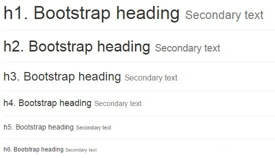
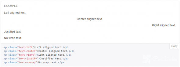
3. Typography – you can properly format the code, quotes, paragraphs, headings, headings with secondary text, subtitles, text alignment, abbreviations, etc. The design is already written in CSS-classes, you just connect the styles and make the correct markup of the document in classes.
At the same time, you can not only place the <h1> H1 Header </ h1> once on the page, but do it several times like this <div class = “h1”> H1 Title </ div>, retaining the same stylistic design, but at the same time not incurring the wrath of the search engines.
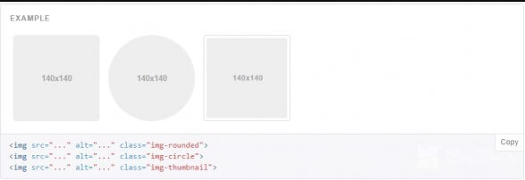
4. Media – allows you to beautifully decorate pictures and videos.
5. Tables – you can draw a table, including adding the ability to sort.

6. Navigation – to create a cool navigation menu on the site. Usually, with navigation there are all sorts of problems – whether with navigation elements or simply layout “as it should”, in general, the task is not easy. And Bootstrap simplifies it, offering tabs, page navigation, breadcrumbs, tabs, side and main menu, navigation toolbar, and so on.

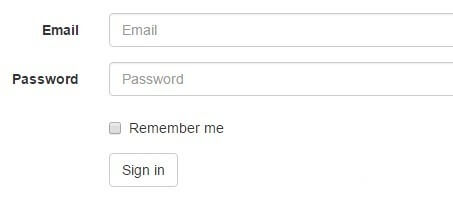
7. Forms – allows you to create various forms: in one or more lines, with prompts and field validation, with radio or checkboxes, labels, and drop-down buttons. In this case, you can highlight the incorrectly filled part of the form, giving a warning to the user when an error occurs in the filling.
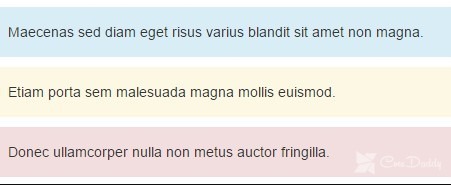
8. Alerts – for registration of dialog boxes. Basically, these are pop-ups or hints – a mistake, warning, success, a hint (info). And to use simple, simply add necessary class and all is ready.

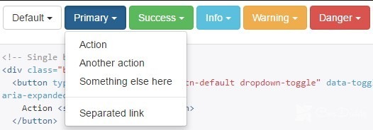
9. Buttons – incl. “Drop-down” buttons. In my opinion, it is excellent!
10. Progress Bars

11. Fonts from icons – an awesome opportunity to add beautiful elements to the design of the site. You can even abandon the formation and use of icon sprites! Truth with limitations: the original copy of the icon can have only one color. Look how beautiful, even ruble is.
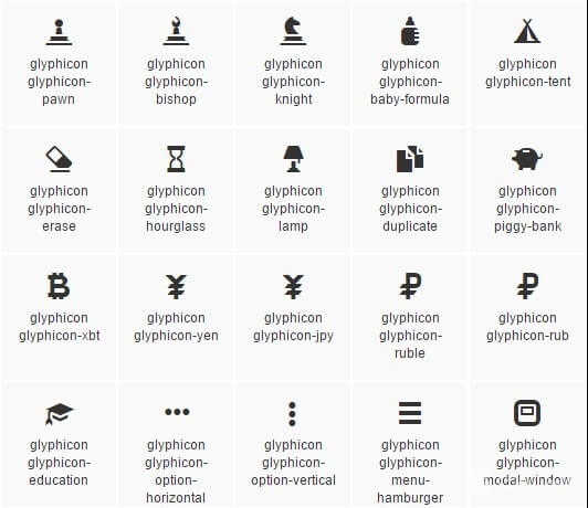
In general, this is about ½ of all possibilities (many of the items have entire branches as far as possible of clearance). Agree, not bad! Bootstrap has long become one of the universal tools in the hands of freelancers – regularly meets the resume in addition to HTML skills ( what is it?) And CSS ( what is it?) Such an inscription: “Bootstrap 3” means a person “fumbles” and is ready to do based on the imposition and CSS styles of bootstrap everything to the customer’s soul.
Bootstrap allows you not to create your own CSS bikes, but to use the ready-made solution, to create on the basis of an understandable and very thoughtful tool. Instead of collecting all its solutions, hacks, and operating time in one box, the frontend needs to use the framework. And Bootstrap is one of the leaders among them.
What I said above – only half the battle. The other half is teamwork. When connecting to an active project, the developer front-line takes a long time to sort out and get along with other people’s bikes in the code. Using Bootstrap 3 implies a clear standardization of classes and styles, which takes less time to figure out the code when moving from project to project.
Especially, if we are talking about freelancing. It’s one thing every time to make a layout from a template invented in the mind and drawn on a notebook, it’s another thing to flash the interface in a bootstrap type framework lightly. And this applies not only to landings, but also service interfaces, admin panels – just about anything.
So, well, with the fact that such a bootstrap like sorted out, now I’ll tell you very shortly how to connect.
How to connect Bootstrap 3, 4 to the site?
Go to getbootstrap.com, where you can download the .zip archive entirely, or create for yourself a list of items and components that you want to apply in your work. So, you can get rid of excess, leaving only the right. You will not believe it, but there are even some developers who take only a grid from Bootstrap and are quite happy with it. You can easily change the variables of styles, responsible for colors and forms, fonts.
After you have chosen to press “Compile and Download”, the archive with the bootstrap.min.css file and the already bootstrap.min.css booted specially compiled for you will start to download! Yes, this optimization is already at the level of the selection of elements, and even with the minification, it makes it possible to make the style file 25% lighter than not minified and even easier by eliminating unnecessary elements.
Then you need to connect this file. This is done simply, just in case, I will remind you how:
<link rel = 'stylesheet' href = '/ css / bootstrap.min.css' type = 'text / css' media = 'all'>
That’s all, you can create and make websites. Work and win!
If you need to be jquery on the site, then do not forget to connect it:
<script src = "http://code.jquery.com/jquery-latest.min.js"> </ script>
Either connect the latest version from Google-IPA or download the library to your site and download it from your hosting. Then you can add a .js file to the bootstrap itself:
<script src = "js / bootstrap.min.js"> </ script>
And, one more script to ensure that in older versions of IE everything was fine:
<script src = "js / respond.min.js"> </ script>
Everything is ready, Bootstrap is connected and configured.
The result
So, Bootstrap is a modern multifunctional framework – you can use it regularly or vice versa only if necessary, but every novice webmaster, coder, or front-end developer must necessarily have in his arsenal a minimum set of skills and knowledge for working with Bootstrap.
Because the scope of its wide and can be ordered using Bootstrap 3, and soon the fourth version. Spend a couple of hours or days studying the documentation, make a couple of simple sites – that’s enough.
Good luck and success!
