Text-shadows: The text-shadow property is not new to CSS-3, it was introduced back in CSS-2, but browsers only started to take it into account recently.
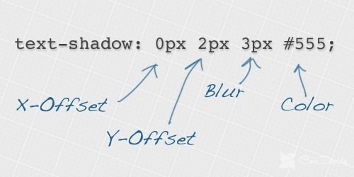
As the name implies, the text-shadow property allows you to create a shadow for text using CSS. Below is the text-shadow syntax.
Syntax

The first value determines the offset of the shadow along the X-axis, i.e., horizontally. If the value is positive, it determines the offset of the shadow to the right of the text, with a negative value, the offset of the shadow to the left of the text. Similarly, the second positive value determines the offset along the Y-axis (vertical), a positive value determines the offset below the text, the negative creates a distance above the text.
The third positive value determines the blur radius of the shadow. If no value is specified, there will be no blur.
Creating text effects with the text-shadow property.
With the text-shadow property, you can make some text effects that you previously could only do with a photoshop or other graphics editor. To get a general idea of how text-shadow can be used, we’ll look at some examples below.
1. A simple shadow for text on CSS
This is a simple example of using the text-shadow property. It creates a 2px shadow along the X-axis and Y-axis, as well as a blur radius of 2px.
color:#7690CF;
text-shadow:2px 2px 2px #48577D;

2. Style engraved text
In this case, only the vertical offset is indicated, without blurring.
color: #666;
text-shadow: 0px 3px 0px #666;

3. Glowing text effect
The glowing effect can be made by adding only the blur radius.
color:#FAF4E8;
text-shadow:0 0 20px #FFE30A;

4. Blurred text
In the example below, everything is done similarly to the previous one, i.e., only the blur radius is specified without horizontal or vertical offset. However, in this example, a transparent color value was used, which indicates that the background color should be transparent. This gives a blur effect.
color: transparent;
text-shadow: 0 0 10px #333;

5. Use multiple shadows
You can specify multiple shadows for the text, separated by commas. An example of using multiple shadows:
color:#F2B405;
text-shadow: 0 0 4px #F24405,
0 -5px 4px #F27405,
2px -10px 6px #F29F05,
-2px -15px 11px #F2E205,
2px -18px 18px #222601;

6. Embossed text
In the example below, two shadows are used. In the first shadow, the horizontal and vertical values are negative, and in the second shadow, positive values are used, which gives relief to the text.
color:#ccc;
text-shadow: -1px -1px #FFF,
1px 1px #333;

7. The border around the text
The following code creates a border effect for text.
color:#7FCAEB;
text-shadow: 0 -1px #00468C,
1px 0 #00468C,
0 1px #00468C,
-1px 0 #00468C;

8. Text in 3D style
A 3D text effect can be created using multiple shadows. To achieve the effect, each shadow is slightly enlarged using the same color.
color:#F2B405;
text-shadow: 2px 2px #F27405,
3px 3px #F27405,
4px 4px #F27405,
5px 5px #F27405


