How to create a logo for a website

In this article, we will look at how to create a logo for a website from the concept to the finished solution.
Before you begin the process of making a logo is necessary to make preparatory work.

Certain activities performed during the preparatory process, provide the most reasonable and appropriate in the specific website logo. Therefore, in the beginning, we consider what kind of activities and what they give us.
1. Designer preferences
Find out and record the wishes and preferences have with your client or you yourself, if you make a logo for yourself. Perhaps the logo should include, any symbols, inscriptions, images, to perform in any color. This can help to make the logo most appropriate to the site and its subject.
2. Research of competitors
After receiving a list of preferences to search and study the websites of competitors in the same niche to determine which design solutions used in the logos of these sites. The study ensures that your logo will differ from competitors and that it will be better than the competition.
3. Sketching and conceptualization
The next step is to directly draw the logo. Here you need to show your creativity and imagination. At this stage, based on design preferences and the research you must draw sketches of the logo. Brainstorm and display all your ideas on paper. In this work, it is necessary to take breaks to think about design and bring fresh ideas.
Below you can see the original page with the sketches that the designer Jacob Cass did when creating the logo for Ultimate Potential.
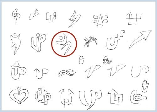
Remember that in brainstorming there are no bad ideas, draw everything that comes to mind. As a result of the many ideas, one was selected sketch.
4. The embodiment on the computer
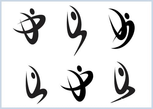
The author of the sketches that you can see above had an idea to use the letters U and P in the logo and to make a figure of a person jumping or floating in the air. After one of the most suitable sketches was chosen, the author experimented with creating different versions of it in Adobe Illustrator. Below you can see six options created by the authors during the experiments. As a result, the left bottom option was chosen. This logo depicts an abstract person jumping or floating in the air, symbolizing energy, good health, life balance, mobility, which corresponds to the theme of the site.
5. The choice of font
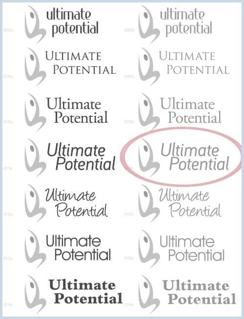
After the General concept and a logo were identified, it is time to add text and choose its font. The author experimented with different layout fonts to understand which option will look the most stylish. If you select do not rely only on your opinion of the show yet who may be your options and ask them to choose the most suitable. From these examples, you selected one option circled in red.
6. Color
After selecting the font it's time to choose the color of the logo and lettering. The author did a lot of color options of the logo you can see in the image below.
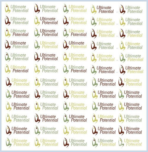
However, he did not decide on a color until it was completed the website design.
7. The final version of the logo
After the completion of the website design was chosen, the color that best joined the website design and looks stylish. As a result, the choice was stopped on a light and dark green color combination. The final version of the logo you can see in the image below.

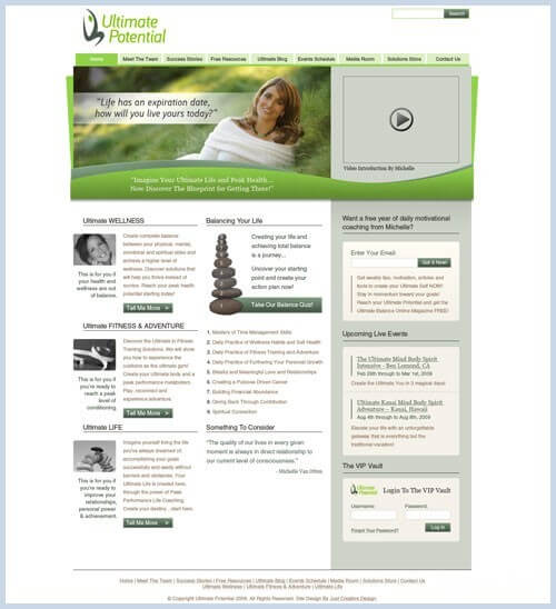
And that's how it looks on the site:
