CSS3 horizontal dropdown menu

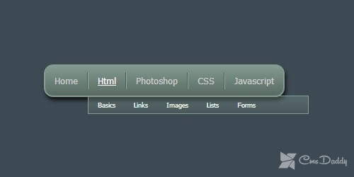
In this article, you will learn how to create a beautiful, professional, horizontal dropdown menu on CSS.
The menu was created using only one image. The gradient, drop shadow, and rounded corners have done using CSS 3.
In this menu, new CSS 3 properties are applied. Remember, these new properties are supported only by the latest versions of Google Chrome, Mozilla Firefox, Safari, and Opera.
Step 1 - Structure horizontal dropdown menu
First, we need to create a menu structure using HTML. To create the structure we will use an unordered list that will contain nested lists to create the dropdown effect: <div id = "navBar1"> <ul> <li class = "headerList1"> <a href="#"> Home </a> </ li> <li class = "headerList1"> <span> <a href="#"> Html </a> </ span> <ul> <li> <a href="#"> Basics </a> </ li> <li> <a href="#"> Links </a> </ li> <li> <a href="#"> Images </a> </ li> <li> <a href="#"> Lists </a> </ li> <li> <a href="#"> Forms </a> </ li> </ ul> </ li> <li class = "headerList1"> <span> <a href="#"> Photoshop </a> </ span> <ul> <li> <a href="#"> Basics </a> </ li> <li> <a href="#"> Buttons </a> </ li> <li> <a href="#"> Logos </a> </ li> <li> <a href="#"> Web layouts </a> </ li> </ ul> </ li> <li class = "headerList1"> <span> <a href="#"> CSS </a> </ span> <ul> <li> <a href="#"> Basics </a> </ li> <li> <a href="#"> Links </a> </ li> <li> <a href="#"> Images </a> </ li> <li> <a href="#"> Navigation </a> </ li> <li> <a href="#"> Forms </a> </ li> </ ul> </ li> <li> <span> <a href="#"> Javascript </a> </ span> <ul> <li> <a href="#"> Basics </a> </ li> <li> <a href="#"> Operators </a> </ li> <li> <a href="#"> Functions </a> </ li> <li> <a href="#"> Loops </a> </ li> <li> <a href="#"> Scripts </a> </ li> </ ul> </ li> </ ul> </ div>In the code above you can see the unordered lists <UL>. UL was added to the parent tag UL and enclosed in an <LI> element. Using this method we can create a drop-down menu after adding the CSS everything will level off and start to look different.
Each list item was assigned to the class headerList1, with the exception of the last paragraph (Javascript). This class will be used to create a separator on the right side of each menu item last menu item does not require a border on the right side, so he was assigned this class.
In addition, the anchor links for each menu item are enclosed in a <span> tag, with the exception of the first paragraph. This will be used to create a border on the left side. This method allows us to have 2 different colored borders, which provides a nice "shiny" effect.
Step 2 - Styling the horizontal drop-down menu with CSS
# navBar1 { float: left; border: solid 2px # 849c92; border-radius: 13px; -moz-border-radius: 13px; -webkit-border-radius: 13px; background: -moz-linear-gradient (bottom, # 596a63, # 829a90); background: -webkit-gradient (linear, left bottom, left top, from (# 596a63), to (# 829a90)); -moz-box-shadow: 2px 5px 7px # 161617; box-shadow: 2px 5px 7px # 161617;}
navBar1 ul ul {
display: none;
}

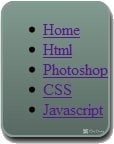
The image on the left shows the result that we get from the use of these styles.
At the beginning of the note on the property border-radius, it gives the opportunity to make rounded corners. Properties border-radius, -moz-border-radius, and -webkit-border-radius asking the same rounded corners only for different browsers. Moz for Firefox and-WebKit for Safari and Chrome, although it is possible that the standard border-radius property will work in newer versions of all browsers. As you can see here you just need to specify a value, in this case, 13px.
Were then added the gradient.
This is made using the usual properties of the CSS background, but with a different value. As well as rounded corners for Firefox uses Moz, this property is specified, where the gradient and the two colors used to create the gradient. For WebKit browsers, a bit more complicated. Here is specified the type of gradient, where it starts, where it ends, as well as two colors for the beginning and end of the gradient.
Finally, you added a shadow to the box menu. As far as I know, this effect currently only works in Safari and Firefox. The box-shadow has 4 values - the horizontal offset, vertical offset, blur radius, and color value.
# navBar1 ul { padding: 0; margin: 0; list-style: none; position: relative;}

Using these styles we got rid of the indent and list items. In addition, it was specified relative positioning. This is done because we will use absolute positioning for nested <UL>.
# navBar1 ul li { display: block; float: left; padding-top: 9px; padding-bottom: 9px;} # navBar1 ul li span a { border-left: solid # 8cab9e thin;}

Here was used the property display: block and float: left; that gives the offset of each menu item to the left and wrapping around. In addition to this, apply padding to the bottom, and from the top, below the menu items are centered.
.headerList1 a { border-right: solid # 505e58 thin;} # navBar1 ul li a { display: block; padding: 4px; padding-left: 13px; padding-right: 13px; color: # d1d1d1; text-decoration: none; font-family: Tahoma, Geneva, sans-serif; font-size: 80%;}

We added the second delimiter to the right, specify the color, size, and font family.
# navBar1 ul li a: hover { color: #ffffff; text-decoration: underline;}
Set change the color and underline of the font when you hover the mouse.
# navBar1 ul ul { position: absolute; top: 42px; background: url (menuDropBG.png); width: 310px; border: thin solid # 849c92; font-size: 70%; display: none;}
Absolute positioning was applied, offset by 42px, as well as the background image, add border, font size, and width for the drop-down menu. Save the applied background image

# navBar1 ul li: hover ul { position: absolute; left: 60px; display: block;}

A submenu is offset to 60px to the right and applied the property display: block; which ensures the visibility of the menu while moving the cursor.
# navBar1 ul ul li { padding: 0; padding-top: 3px; padding-bottom: 2px;} # navBar1 ul ul li a { border: none; color: white;}
Final touches allow you to get rid of the unwanted border and change text color.
Remember that not all CSS 3 properties are supported by modern browsers. This lesson is designed to show you some new features in CSS 3.


