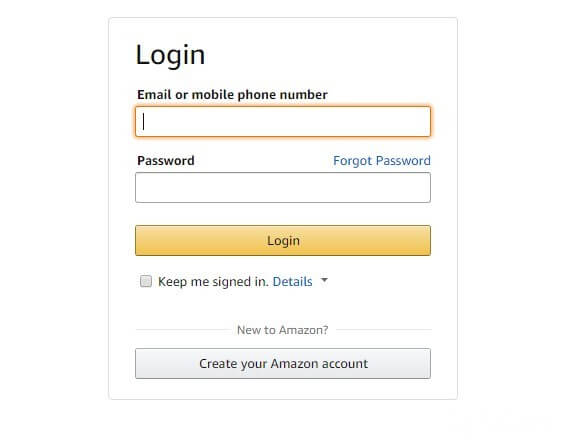
If you are a Twitter user, you may have already seen the animated, blue glow effect that the Twitter account login fields have.

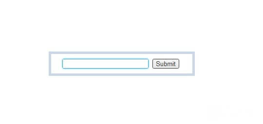
Now we will create the same animation effect using the transition property and the glow effect using the box-shadow property.
You can see the result of what can happen in the image below or by visiting the Twitter log-in page.

First, let’s set the fields of the animation:
input {
transition: all 0.30s ease-in-out;
-webkit-transition: all 0.30s ease-in-out;
-moz-transition: all 0.30s ease-in-out;
outline:none;
}
Using the transition property, we will create an animation so that the glow appears smoothly, while the form field becomes active. In addition, here we use the outline property to remove the glow for Safari and Chrome browsers, in which this functionality is provided by default.
Now that we’ve prepared everything for the code, you can start creating a glow effect using the box-shadow property, which sets the shadow of various objects. But our glow will not look like a shadow, because we will use a bright blue color. In addition, we use RGB color codes, so we can adjust the level of transparency. Values of HTML and RGB color codes, you can find in the table HTML color codes.
The code for glow effect will look like this:
input:focus {
border:#35a5e5 1px solid;
box-shadow: 0 0 5px rgba(81, 203, 238, 1);
-webkit-box-shadow: 0 0 5px rgba(81, 203, 238, 1);
-moz-box-shadow: 0 0 5px rgba(81, 203, 238, 1);
}
In addition to the glow, you can round the corners of the form field using the border-radius properties.
Editor’s note:
In this case, the author does not code styles, with which you can create rounded corners. If you want to do this, add the code above in the following properties and values:
border-radius:5px;
-moz-border-radius:5px;
-webkit-border-radius:5px;
– where instead of 5px can set any value you want to round the corners.
As a result, you should get something like this:

The whole code will look like this:
input {
transition: all 0.30s ease-in-out;
-webkit-transition: all 0.30s ease-in-out;
-moz-transition: all 0.30s ease-in-out;
outline:none;
}
input:focus {
border:#35a5e5 1px solid;
box-shadow: 0 0 5px rgba(81, 203, 238, 1);
-webkit-box-shadow: 0 0 5px rgba(81, 203, 238, 1);
-moz-box-shadow: 0 0 5px rgba(81, 203, 238, 1);
}